Tufte One Day Course Retrospective
Earlier this week, I had the distinct pleasure of attending Edward Tufte’s one-day course. For those unfamiliar with Tufte, he is a master in data visualization and presentation, and one of the preeminent thinkers in the field. I had been referred to Tufte’s work but my mentor and have read one of his books, however seeing him in person really brings his work to life. Tufte’s 25 years as a teacher shines through, as he presents a dense amount of information in a compressed time frame. Moreover, he comes off as genuinely sincere and has none of the trappings of a self-help snake-oil salesman or the business marketing guru who is trying to teach you that 25 secrets to success. Rather the course, is a treatise on clearly communicating information, especially high density high data information. What struck me was the way that Tufte’s presentation was an in person demonstration of what he was teaching.
Highlights included:
- The concept of providing a hand out to your audience before hand because it speeds The transfer of information
- Overcoming the tyranny of PowerPoint and how you want information presented adjacently in space rather than temporally through slides
- Avoiding low-density/chart-junk graphics
- Examples of good visual demonstrations and why they’re good.
- Why dashboards are bad communicators of information
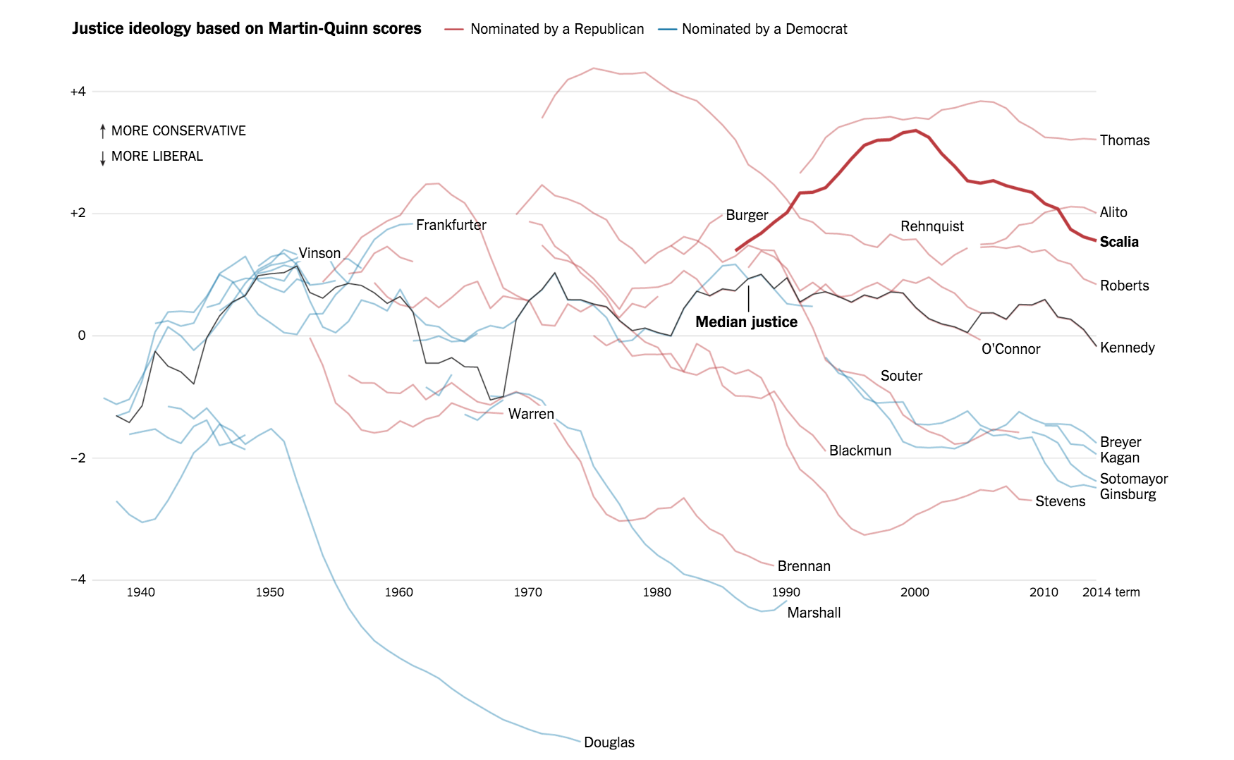
Tufte is particularly fond of the NYTimes infographics, which show up almost every day, for example this was on the front page when I went to write this:

These demonstrate how the best in the industry pull together dense amount of information, on a tight time frame, and for consumption for the masses. For the technically minded, these are often written with D3 and frequently showcase the power of that library.
I highly recommended the one day course and his books to learn more.